Fonts are, in general, great to have around. You can make papers, advertisements and webpages look really spiffy with a good font, but occasionally {well, a LOT of the time}, they become totally out of control. We'd like to draw your attention to one font that drives us particularily insane : Remedy.
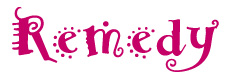
That's what Remedy looks like {duh}. We've seen it around a lot
lately, and find this fact pretty disgusting. Designers like to use it
to give a project that "funky" and "fun" look, but we think a better way
to describe the look Remedy lends is "barfed upon." There are several
different versions of this font : Single, Double and Double Extras - each
version adding more and more swirls, loops, dots and other zany effects
to the alphabet, each version one step closer to making our heads
explode. We don't know what sort of crack the designers at Emigre', a
usually impressive design company, we smoking when they came up with this
nonsense, but it must have been pretty high quality stuff.
But hey - maybe you're thinking "Remedy's not that bad - it's actually kind of cute! It might be ok if used in moderation." Maybe you're also wearing one of those tiny t-shirts with a heart on it, but that's a different subject for our Disgust alltogether. The fact is, you're wrong. The use of Remedy will only encourage this nasty "funky" font trend and encourage the creation of even MORE horrific Remedy rip-offs. Face it - Remedy is disgusting.
Plus, it rots your teeth.